This document provides guidelines to ensure the correct use of the PHOENIX brand identity. Our brand is key to ensuring that our outreach presents the organization consistently throughout the world. A strong brand aids recognition of PHOENIX by our audiences, conveys what we stand for and helps to build a reputation for excellence.
By applying these guidelines to your communications, campaigns and materials you will strengthen the PHOENIX brand image and enhance the visibility of the organization.
Company Overview
The story of PHOENIX for 100 years, it was a history of innovation
California in U.S., there is headquarters factory of PHOENIX. In this place, the head lanterns and burners which are symbolic products of Phoenix have been produced by skilled workers. The PHOENIX is an out-door brand company with long history, which pursues being innovative constantly.
The Phoenix was reformed from its strong image
The Phoenix is now introducing new woman and child friendly designed products to be with them.
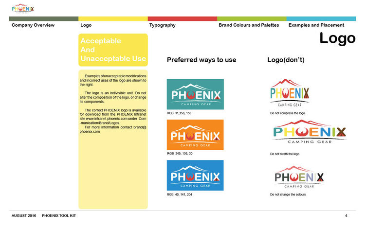
Logo
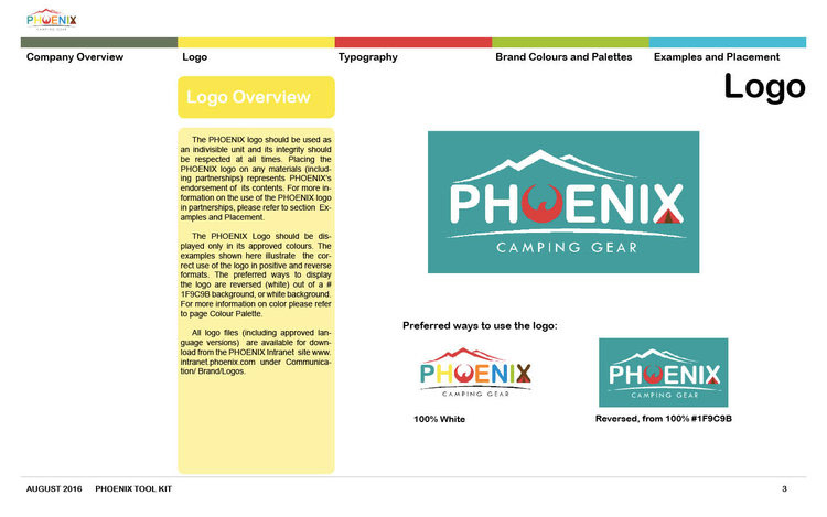
Overall concept: Using bright colors and icons to preserve a feminine and friendly image.
Logo color: Using colors of mountains, seas, trees, fire, and stones, which are the main elements of camping.
Logo Icon: Using images of mountains, trees, and tents, which are representative images of camping.
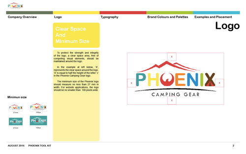
Clear Space And Minimum Size
To protect the strength and integrity of the logo, a clear space area, free of competing visual elements, should be maintained around the logo.




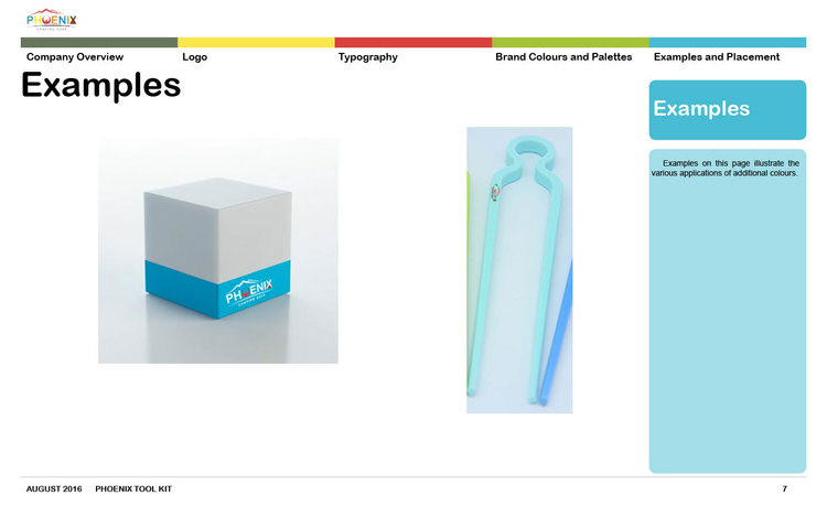
The PHOENIX Product Mockup
The PHOENIX was reformed from its strong image. The PHOENIX is now introducing new woman and child friendly designed products to be with them.